Gallery Wall Ideas for a Collected and Balanced Home
Create a personal, balanced gallery wall with practical guidance on scale, spacing, mixed frames, staircase displays, picture ledges, and secure hanging.
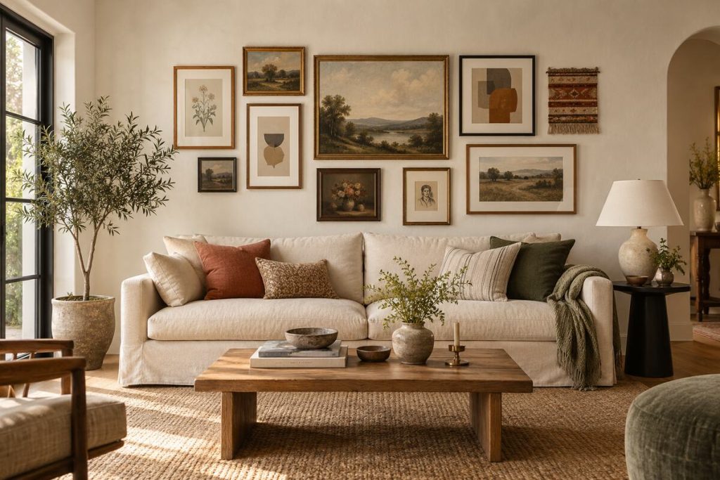
A gallery wall can turn an ordinary stretch of wall into the most personal part of a home. It gives photographs, paintings, prints, and collected objects a shared place instead of leaving them scattered in drawers or leaning in forgotten corners. The best gallery wall ideas feel expressive without looking accidental: the art has variety, but the arrangement still relates to the furniture, architecture, and colors around it.
That balance comes from a few practical decisions made before the first nail goes into the wall. Scale matters more than the number of frames, spacing matters more than perfect symmetry, and a clear visual thread matters more than buying a matching set. Whether you are decorating above a sofa, along a staircase, or inside a small dining nook, the goal is to create one composition that can be understood from across the room and enjoyed up close.
Begin With the Wall and the Furniture Below It
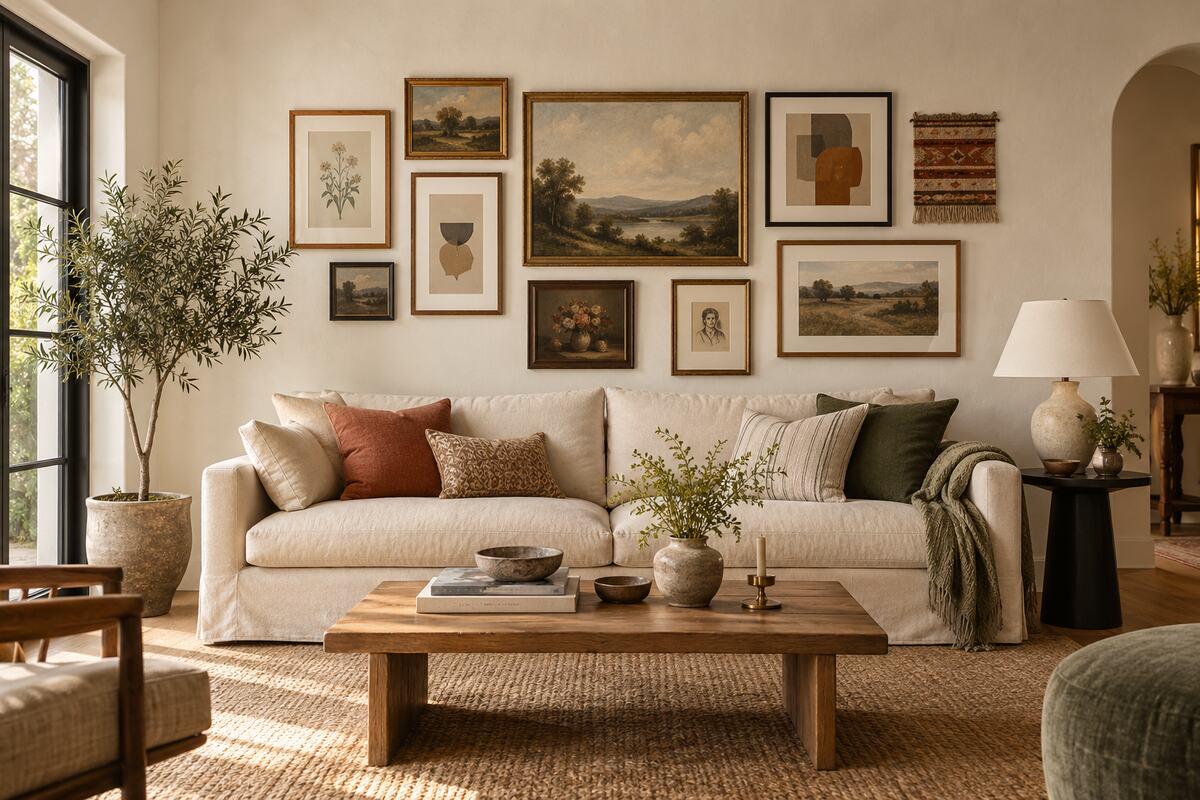
Before choosing art, study the wall as part of the whole room. A display above a sofa, bed, console, or dining table should feel connected to that furniture rather than floating independently. Measure the width of the furniture and the usable wall area, including the space affected by lamps, curtains, switches, vents, and doors. A gallery that is too narrow can look timid; one that reaches far beyond the furniture may make the arrangement feel unstable.
As a flexible starting point, let the grouping occupy a substantial portion of the furniture width while leaving visible wall around it. Exact proportions depend on the room and the shapes of the pieces, so use paper templates instead of relying on a fixed formula. Keep the lowest frame high enough that seated heads will not touch it, but low enough that the gallery visually belongs to the furniture.
Rooms without furniture below the display need another reference. A doorway, stair rail, centered wall section, or architectural opening can provide the boundary. This room-first approach supports the same functional thinking found in our guide to beautiful and functional interiors.
Choose a Unifying Thread Before You Collect Frames
A gallery wall does not need identical art, but it benefits from a repeated idea. The connection might be a restrained color palette, a subject such as landscapes or botanical studies, a shared mood, or a limited selection of frame finishes. Repetition gives the eye a path through the display while variation keeps it interesting.
Start with pieces you genuinely want to see every day. Place them together and look for relationships: perhaps several works contain muted green, warm ochre, or fine black lines. Use those clues to select the remaining pieces. Family photographs can sit beside paintings if their tones or mat colors relate. A small textile, ceramic plaque, or relief can add texture, but three-dimensional objects should be light enough to mount securely.
Avoid filling gaps with generic art simply because it fits. It is better to begin with a smaller, complete arrangement and allow it to grow. The result will feel collected over time rather than purchased as a single decorative package.
Plan the Complete Footprint on the Floor
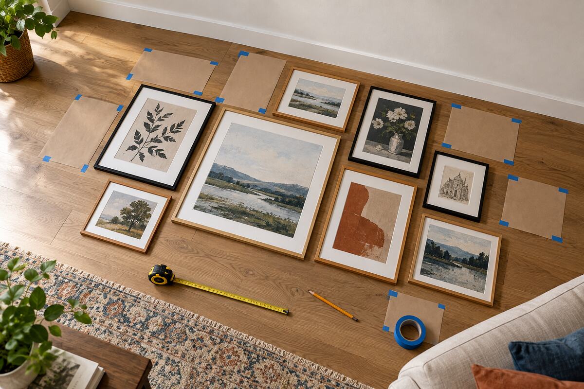
Arrange every frame on a clean floor before hanging anything. Mark a rectangle with painter’s tape that represents the available wall area, then move the frames until the collection reads as one shape. Step back, take a photograph, and view it from different angles. A phone photo often reveals awkward gaps that are less obvious while standing over the layout.
Choose one visual anchor. It may be the largest artwork, the darkest frame, or the most meaningful piece. The anchor does not have to sit in the exact center, but the other elements should distribute visual weight around it. Balance a large dark frame with several lighter pieces or another strong element across the composition rather than mirroring it exactly.
Once the layout works, trace each frame onto kraft paper. Mark the hanger position on every template and tape the paper shapes to the wall. Live with the mock-up for a day if possible. Check it while sitting, entering the room, and under evening light before committing to holes.
Keep Spacing Consistent Even When Frames Differ
Consistent gaps are one of the simplest ways to make mismatched art feel intentional. The eye notices irregular spacing quickly, especially when two frames nearly touch while another pair sits far apart. Select a modest gap that suits the scale of the room and repeat it through the densest parts of the display.
Not every edge must align. In an organic arrangement, the outer contour can step in and out, but the spaces between neighboring pieces should feel related. In a formal grid, matching frame sizes, mat openings, and perfectly level rows are more important. Pick one approach early; combining a strict grid on one side with a loose cluster on the other often looks unresolved.
Use a tape measure and level for final placement rather than judging by sight alone. Walls, ceilings, and furniture are not always perfectly straight, so compare the arrangement with the element that matters most visually, usually the furniture below or the main architectural line.
Follow the Architecture on a Staircase Wall
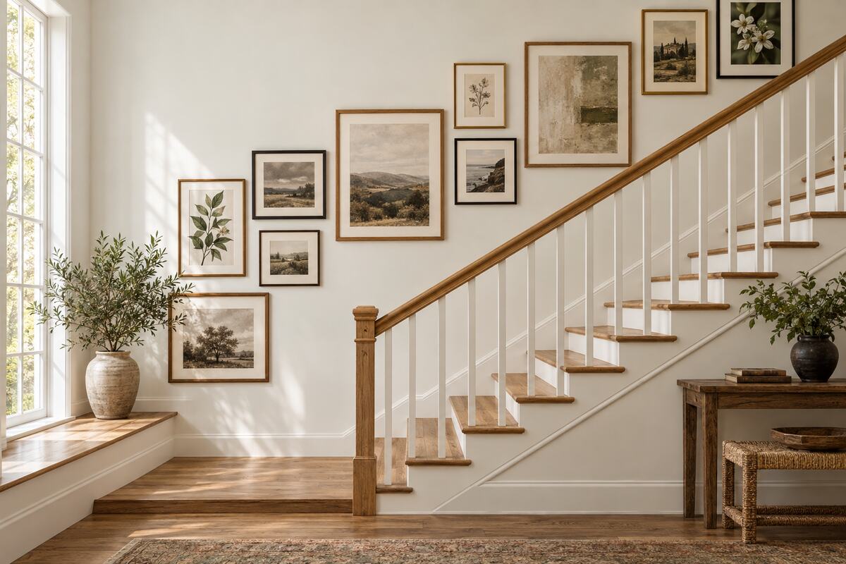
Staircase walls offer generous display space, but the diagonal movement requires a different plan. Instead of creating a horizontal rectangle, arrange the visual center of the frames so it rises with the stairs. Paper templates are especially useful here because the display must look balanced from the bottom, the landing, and the upper floor.
Begin with two or three larger pieces spaced along the route, then connect them with smaller works. Maintain safe clearance from the handrail and avoid frames that project into the walking path. If the staircase is narrow, shallow frames with secure fixings are a better choice than heavy shadow boxes.
Repeated colors or frame materials help unite a long diagonal collection. Black-and-white photographs mixed with muted botanical prints can work well when the mats share a warm white tone. The display should enhance the stair’s movement rather than compete with every step and railing detail.
Use Fewer Pieces in a Small Room
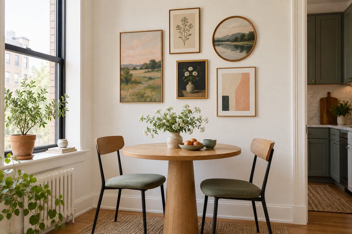
A small room does not require tiny art. Several miniature frames can create visual noise, while one medium anchor and a few supporting pieces often feel calmer. Use the height of the wall when floor width is limited, but keep the display connected to the table, bench, or cabinet beneath it.
In a narrow dining nook or entry, a vertical arrangement can guide the eye upward. Mix one round or softly shaped frame into a group of rectangles to break repetition without adding clutter. Pale mats and some visible wall between the pieces will help the composition breathe.
Reflective glass can create glare opposite a bright window, so test the frames at different times of day. Anti-reflective glazing or unglazed canvas may be more comfortable in a very sunny corner. For more ways to keep a compact home expressive without crowding it, see our small-space decorating ideas.
Mix Frame Finishes With a Simple Ratio
Mixed frames make a gallery feel layered, but too many unrelated finishes can distract from the art. Choose one dominant material and one or two accents. Warm oak could lead the collection, with smaller touches of matte black and aged brass. Repeating each accent at least once makes it look deliberate.
Mats can provide another level of consistency. Warm white mats soften vintage art and natural materials, while crisp white can suit graphic prints. Varying mat widths is fine, but avoid a random mixture of bright white, cream, and gray unless those shifts support the artwork.
Consider the finishes already present in the room. Frames do not have to match the coffee table or lamp exactly; they only need to participate in the same visual language. This is particularly helpful in living rooms, where a gallery wall can reinforce the comfort and proportion described in our living room design guide.
Hang Art Securely and Protect the Wall
Use hardware suited to the frame weight and wall construction. Lightweight pieces may need simple picture hooks, while large or heavy frames can require anchors, screws into studs, or a French cleat. Follow the hardware and frame manufacturer’s instructions, and seek professional help when the wall material or weight is uncertain.
Measure the distance from the frame top to the fully tensioned hanging wire; a loose wire changes the final height. For frames with two hanging points, mark both accurately and check them with a level. Small adhesive bumpers on the lower back corners can keep frames stable and protect painted surfaces.
Do not hang valuable works where moisture, strong heat, or prolonged direct sunlight can damage them. Kitchens and bathrooms may require more durable pieces and appropriate glazing. In homes with active children or pets, avoid heavy frames above frequently used seating unless they are professionally secured.
Choose Picture Ledges for a Flexible Display
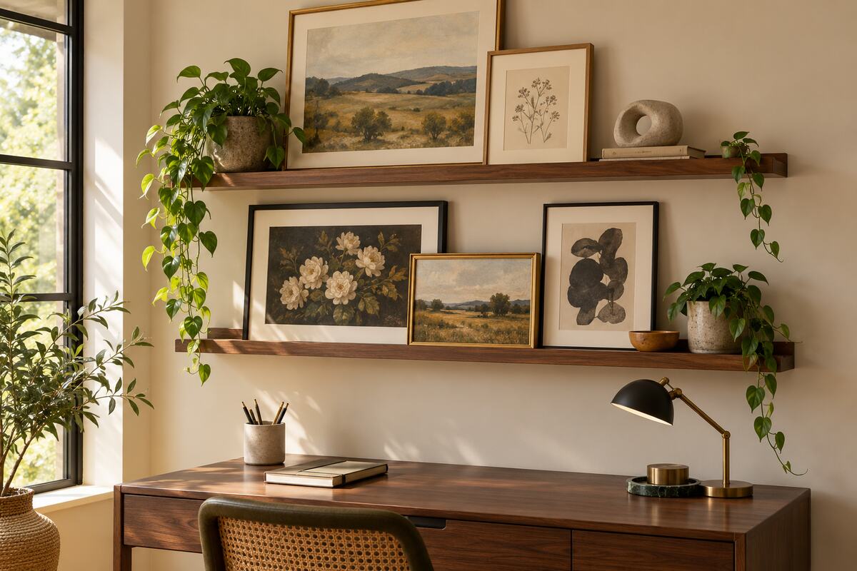
Picture ledges are useful when you enjoy changing art or want fewer holes in the wall. Lean the largest frame at the back, place medium pieces in front, and overlap edges only enough to create depth without hiding important parts of the artwork. Leave some empty ledge so the display does not become a continuous crowded shelf.
Two ledges can form a flexible gallery above a desk or low cabinet. Vary frame heights rather than filling both shelves with equally sized pieces. A small sculpture or plant can introduce texture, but use accessories sparingly and keep watering away from artwork and electronics. Our indoor plant styling guide offers practical ideas for choosing suitable placements.
Install ledges into appropriate supports and respect their stated weight limits. Frames should lean securely, especially in busy circulation areas. If earthquakes, vibration, children, or pets are a concern, add discreet restraints rather than relying on gravity alone.
Edit the Collection So It Can Evolve
A gallery wall is most successful when it can change with the home. Keep a record of the layout and store unused art carefully. Replacing one or two pieces seasonally can refresh the room without redesigning the entire wall. Photographs, children’s art, travel sketches, and small original works can gradually make the display more personal.
Edit before adding. If a new piece makes the wall feel crowded, remove something rather than shrinking every gap. Pay attention to visual weight, not only physical dimensions: a small black frame can balance a much larger pale print. Step back often and judge the composition as a whole.
The strongest gallery wall ideas combine meaning with structure. Start with art you value, connect it through color or mood, test the complete footprint, and hang it with consistent spacing and secure hardware. When the arrangement supports the room instead of filling every available inch, it will feel collected, balanced, and uniquely yours.